September 28, 2026 · Method · v5
Redesigning the homepage, one version at a time
Three versions of the polarize.tech homepage and the one that shipped, from a post list in a sidebar to a white page with magenta buttons and specimen drawings: what each one tried, what was kept, and how the result became components in the design system.
- [A]
In short
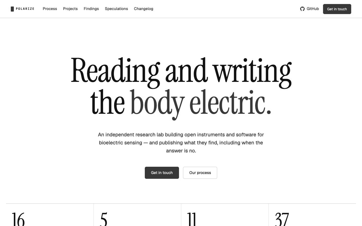
The homepage went through several versions, each one kept. The first tried a familiar product-site layout and the third threw out every rule. The one that shipped took the first one’s spacing, cards, drawings and numbers onto a white page with magenta. It became polarize-ui’s landing layer, so every page on the site uses it.
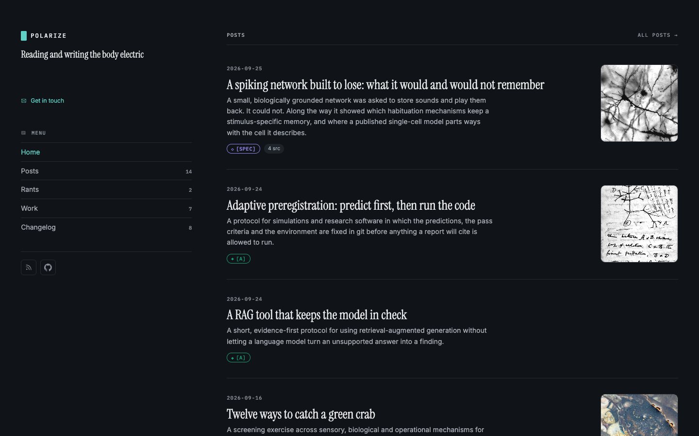
Until this week the homepage was a list. It showed the four latest posts, the speculations and the most recently active repositories, inside the same sidebar layout as every other page. It was accurate, and it said nothing about what this lab is for.
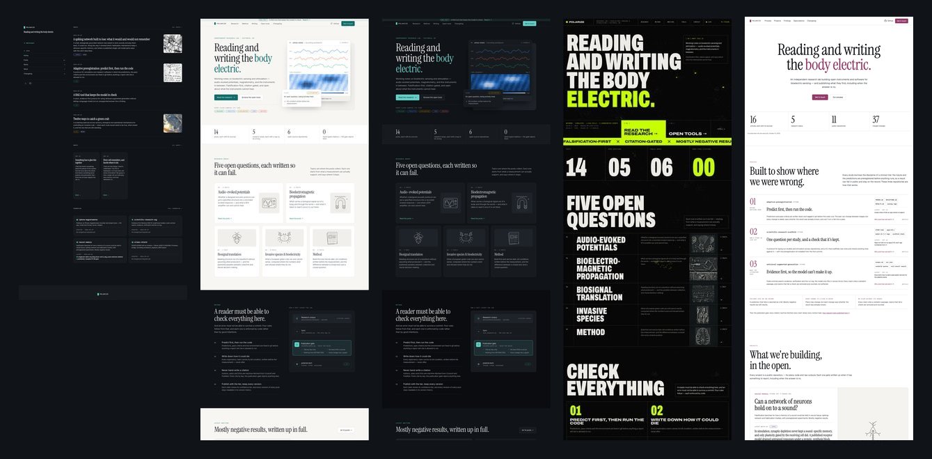
The redesign was done in the open, in conversation with Claude on a design canvas where every version stayed side by side. Then it was built with Claude Code. Three directions, oldest first, and then the one that shipped:
1. A familiar front door
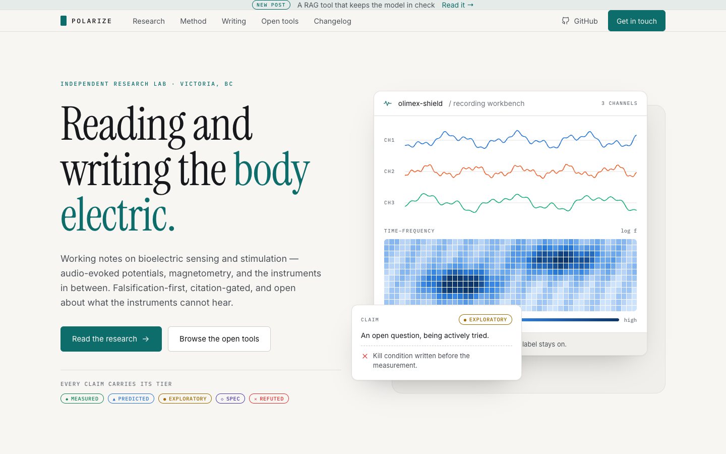
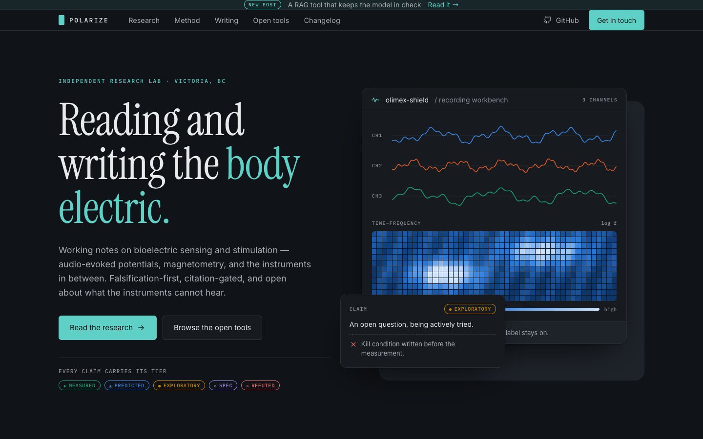
The first brief was a proper homepage for a research lab, borrowing the feel of product sites like DigitalOcean and Intercom: a big headline, a product shot, and sections for what the lab does. It was built strictly on polarize-ui, the design system these pages already used: the display serif for headings, the mono face for labels, and never bold.
The product shot was a mock recording workbench, with three channels and a time–frequency map. It carried a TASTE badge saying it was an illustration and not a recording. Even as decoration, the page kept the rule every page here follows: a label may never be hidden.
2. Dark
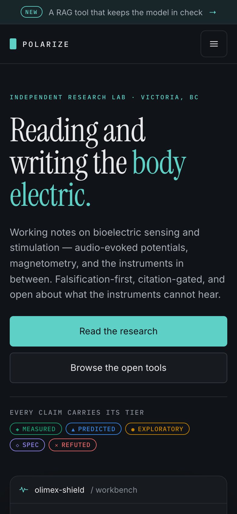
The same page in the design system’s dark palette. It was an easy change, because every colour is a token.
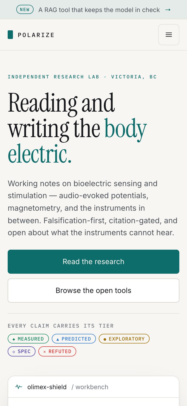
Both of the first two versions had a phone layout too, drawn as separate artboards.
3. No rules
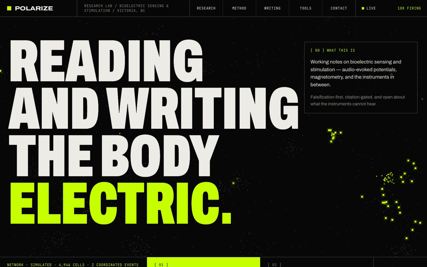
To see what the rules were costing, one version dropped all of them: a condensed grotesque, acid green, 1px grid lines everywhere, and a simulated network of about five thousand cells behind the whole page. Those cells fire on their own, set off their neighbours, and sometimes fire together as waves, synchronised colonies or rhythmic bursts. A live counter in the top bar says how many are firing, and the footer says it is a simulation.
It was the loudest version and the least like the lab.
4. The one that shipped
The version that shipped took the most from the first. It kept that version’s spacing, cards, line drawings and numbers, and set them on a white page with magenta where the first had teal. Nothing moves in the background. The display serif stayed. The running text moved from Inter to Geist, self-hosted like the other faces. The mono labels stayed too, because a tier badge is always set in mono.
The numbers sit in a strip under the heading: posts, research topics, public repositories and merged changes, each counted when the site is built. The process is a set of numbered rows, and each research topic has a numbered card with its drawing. The archival plates the site already had are still used, inked dark for a light page.
The content changed more than the look. Looking at how other labs present themselves helped, especially Michael Levin’s lab site and his separate essay site, Thoughtforms. They pointed to an order: lead with the work, let the articles report what it found, and give speculation its own quieter room. So the homepage opens with the process that keeps results honest. Then come the projects, the changelog, the findings, the speculations and the design system.

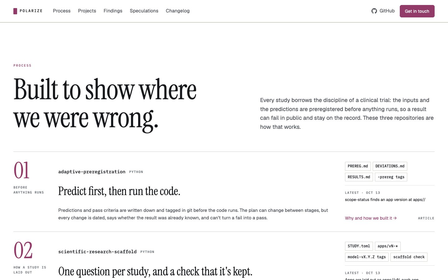
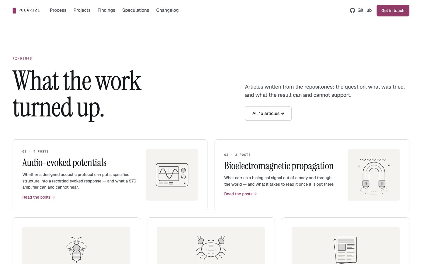

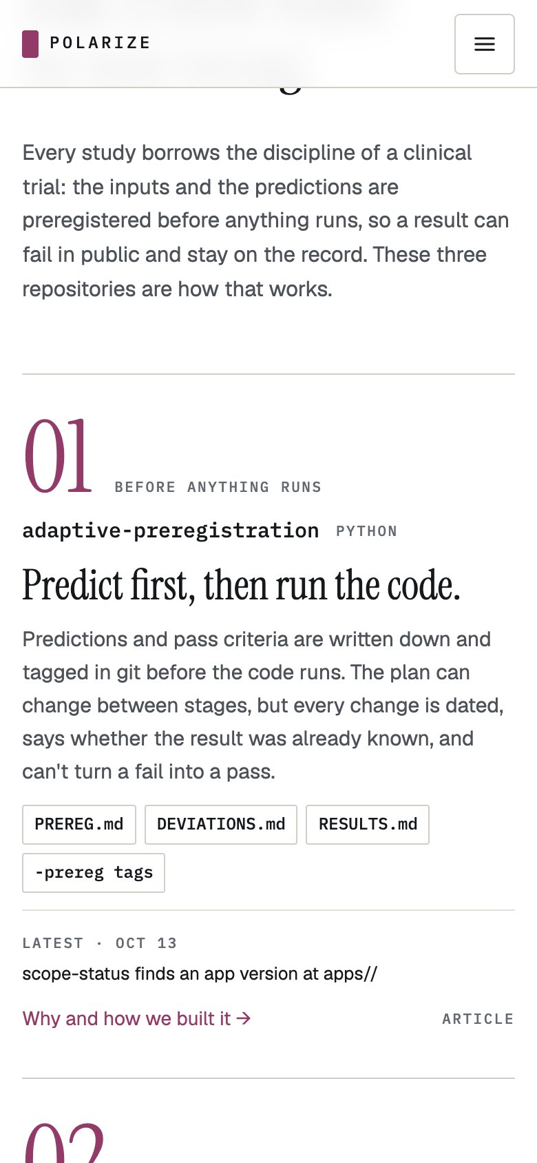
5. From canvas to components
A design that lives only on a canvas has to be rebuilt by hand for every page, and it drifts. So it went into polarize-ui as components, in both of its forms: a zero-build stylesheet for plain HTML sites like this one, and React components that render the same classes.
The landing layer covers the top bar, hero, section heads, the counts strip, the numbered process
rows, project features, topic cards, repository cards, the changelog feed, article cards, story
cards, archival plates and the footer. The look itself is a theme, fieldguide: white, magenta
and Geist. The design system’s own checks hold the new stylesheet to the same rules as the rest:
no raw colours, never bold, and uppercase only in the mono face.
It shipped as polarize-ui v0.5.19, and every page on this site uses it.
What was kept
Every version is still on the canvas, and the rules did most of the work. The versions that broke them were useful for finding out what the rules cost, and each time the answer was less than it first looked. These are the ones that survived:
- The type rules. The display serif is for headings, the sans is never bold, and uppercase is always mono.
- The label rule. Decoration says it is decoration. A tier badge can never be hidden.
- Real content only. Every card is built from the site’s own data: posts, essays, repositories and the changelog. A project’s finding is always its own post’s summary, never a line written for the homepage.
- The first version’s layout. Its spacing, cards, drawings and numbers, on a different page.
The components are in polarize-ui.
Version history 5 revisions
Generated from this site's git history. with Claude means the commit carries a co-author line for an Anthropic model: an LLM took part in that change, not necessarily in every word of it, and git cannot say which. The same history on GitHub →
-
v5 2026-10-15 14:31 Revision (subject withheld on request)
description: >-FiveThree versions of the polarize.tech homepage and therestyleone thatreplacedshipped,thefrom aone that shipped, from apost list in a sidebar to a white page with magentabuttons and specimen drawings: what each one tried, what was kept, and how theA passage was withheld from this history.summary: >-The homepage went throughfiveseveral versionsin a day, each one kept. The first tried afamiliar product-site layout,and the third threw out every rule,.and theThe one thatshipped took pieces from all of them. A later restyle went back to the first: itsshipped took the first one's spacing, cards, drawings and numbers,ononto a whitepage with magenta. What survivedpage with magenta. It became polarize-ui's landing layer, so every page on thesite uses it.site uses it.image: /assets/posts/homepage-redesign-fieldguide.jpg<figure class="shot shot--wide"> <a href="{{ '/assets/posts/homepage-redesign/00-before.jpg' | relative_url }}"><img src="{{ '/assets/posts/homepage-redesign/00-before.jpg' | relative_url }}" alt="The old homepage: a sidebar with the brand, a menu and counts, beside a list of the latest posts with thumbnails." loading="lazy" /></a> <figcaption>Before: the homepage as a post list inside the blog's sidebar layout.</figcaption> </figure>A passage was withheld from this history.<figure class="shot shot--strip"> <div class="shot__scroll"><a href="{{ '/assets/posts/homepage-redesign/0807-filmstrip.jpg' | relative_url }}"><img src="{{ '/assets/posts/homepage-redesign/0807-filmstrip.jpg' | relative_url }}" alt="The top of the homepage versions side by side: the old post list, the light version, the dark version, the no-rules version and the current white page with magenta buttons." loading="lazy" /></a></div> <figcaption>The top of each version, oldest first: before, light, dark, no rules, and thepageoneasthatit is nowshipped. Scroll sideways on a phone.</figcaption> </figure>## 1. A familiar front door## 2. DarkThe same page in the design system's dark palette. It was an easy change, because every colour is a token.It was also the first sign that the lab reads better at night.<figure class="shot shot--wide"> <a href="{{ '/assets/posts/homepage-redesign/02-dark.jpg' | relative_url }}"><img src="{{ '/assets/posts/homepage-redesign/02-dark.jpg' | relative_url }}" alt="Version two: the same layout in a dark palette with a teal accent." loading="lazy" /></a> <figcaption>Version two: the same page, dark.</figcaption> </figure>To see what the rules were costing, one version dropped all of them: a condensed grotesque, acid green, 1px grid lines everywhere, and a simulated network of about five thousand cells behind the whole page. Those cells fire on their own, set off their neighbours, and sometimes fire together as waves, synchronised colonies or rhythmic bursts. A live counter in the top bar says how many are firing, and the footer says it is a simulation.It was the loudest version and the least like the lab, but the cells stayed.<figure class="shot shot--wide"> <a href="{{ '/assets/posts/homepage-redesign/04-no-rules.jpg' | relative_url }}"><img src="{{ '/assets/posts/homepage-redesign/04-no-rules.jpg' | relative_url }}" alt="Version three: an enormous condensed uppercase headline in white and acid green, a grid of mono labels, and clusters of green squares firing in the background." loading="lazy" /></a> <figcaption>Version three: no rules. The top bar counts how many simulated cells are firing.</figcaption> </figure>A passage was withheld from this history.The version that shipped took the most from the first. It kept that version's spacing, cards, line drawings and numbers, and set them on a white page with magenta where the first had teal. Nothing moves in the background. The display serif stayed. The running text moved from Inter to [Geist](https://vercel.com/font), self-hosted like the other faces. The mono labels stayed too, because a tier badge is always set in mono.The numbers sit in a strip under the heading: posts, research topics, public repositories and merged changes, each counted when the site is built. The process is a set of numbered rows, and each research topic has a numbered card with its drawing. The archival plates the site already had are still used, inked dark for a light page.The content changed more than the look. Looking at how other labs present themselves helped, especially [Michael Levin's lab site](https://drmichaellevin.org) and his separate essay site, [Thoughtforms](https://thoughtforms.life). They pointed to an order: lead with the work, let the articles report what it found, and give speculation its own quieter room. So the homepagenowopens with the process that keeps results honest. Then come the projects, the changelog, the findings, the speculations and the design system.## 5. Back to the first versionThe numbers came back as a strip under the heading: posts, research topics, public repositories and merged changes, each counted when the site is built. The process became numbered rows, and each research topic got a numbered card with one of the specimen drawings that pass 4.3 had swapped for archival plates. The plates are still used, inked dark for a light page.<figure class="shot shot--wide"> <a href="{{ '/assets/posts/homepage-redesign/08-live-hero.jpg' | relative_url }}"><img src="{{ '/assets/posts/homepage-redesign/08-live-hero.jpg' | relative_url }}" alt="The current homepage: the centred serif heading on white with a magenta “body electric.”, a solid magenta and an outlined button, and the top of the four counts." loading="lazy" /></a> <figcaption>Live: the heading, the two buttons and the counts beneath them.</figcaption> </figure><figure class="shot shot--pair"> <a href="{{ '/assets/posts/homepage-redesign/08-live-mobile.jpg' | relative_url }}"><img src="{{ '/assets/posts/homepage-redesign/08-live-mobile.jpg' | relative_url }}" alt="The current homepage on a phone: the heading, description, two buttons and the first counts." loading="lazy" /></a> <a href="{{ '/assets/posts/homepage-redesign/08-live-mobile-process.jpg' | relative_url }}"><img src="{{ '/assets/posts/homepage-redesign/08-live-mobile-process.jpg' | relative_url }}" alt="The Process section on a phone: the 01 row stacked in one column." loading="lazy" /></a> <figcaption>On a phone: the hero, and the process rows stacked.</figcaption> </figure>##65. From canvas to componentsA design that lives only on a canvas has to be rebuilt by hand for every page, and it drifts. So it went into polarize-ui as components, in both of its forms: a zero-build stylesheetand custom elementfor plain HTML sites like this one, and React components that render the same classes.A passage was withheld from this history.The restyle went the same way. It is a theme in polarize-ui, `fieldguide`, with a few new components: the buttons, the counts strip, the numbered rows and the topic cards. It shipped as polarize-ui v0.5.19, and the other themes are unchanged.It shipped as polarize-ui v0.5.19, and every page on this site uses it.## What was kept- **Real content only.** Every card is built from the site's own data: posts, essays, repositories and the changelog. A project's finding is always its own post's summary, never a line written for the homepage.- **The first version's layout.**The restyle came back to itsIts spacing, cards, drawings and numbers. The cells,theononeathingdifferenttaken from the version with no rules, went with itpage.A passage was withheld from this history. -
v4 2026-10-15 14:25 Post: show the current homepage in "Redesigning the homepage"
description: >-Five versions of the polarize.tech homepage,fromandathepostrestylelistthatinreplaceda sidebar to atheA passage was withheld from this history.one that shipped, from a post list in a sidebar to a white page with magentabuttons and specimen drawings: what each one tried, what was kept, and how thewhat was kept, and how theresult became components in the design system.date: 2026-09-28 10:00:00 -0600familiar product-site layout, the third threw out every rule, and the one thatshipped took pieces from all of them.WhatAsurvivedlaterbecamerestylepolarize-ui'swentlandingback to the first: itsspacing, cards, drawings and numbers, on a white page with magenta. What survivedbecame polarize-ui's landing layer, so every page on the sitenowuses it.image: /assets/posts/homepage-redesign-fieldguide.jpgimage_alt: >-Theredesignedcurrent polarize.tech homepage: the heading "Reading and writing the bodyA passage was withheld from this history.touch" buttons beneath.beneath and a row of four counts below them.image_credit: Screenshot of polarize.tech. Desaturated for this site.A passage was withheld from this history.## 5.From canvasBack tocomponentsthe first versionThe numbers came back as a strip under the heading: posts, research topics, public repositories and merged changes, each counted when the site is built. The process became numbered rows, and each research topic got a numbered card with one of the specimen drawings that pass 4.3 had swapped for archival plates. The plates are still used, inked dark for a light page.<figure class="shot shot--wide"> <a href="{{ '/assets/posts/homepage-redesign/08-live-hero.jpg' | relative_url }}"><img src="{{ '/assets/posts/homepage-redesign/08-live-hero.jpg' | relative_url }}" alt="The current homepage: the centred serif heading on white with a magenta “body electric.”, a solid magenta and an outlined button, and the top of the four counts." loading="lazy" /></a> <figcaption>Live: the heading, the two buttons and the counts beneath them.</figcaption> </figure><figure class="shot shot--wide"> <a href="{{ '/assets/posts/homepage-redesign/08-live-process.jpg' | relative_url }}"><img src="{{ '/assets/posts/homepage-redesign/08-live-process.jpg' | relative_url }}" alt="The Process section as numbered rows: a large magenta 01 and 02, each with its repository, a heading, a description, its files and its latest change." loading="lazy" /></a> <figcaption>Live: the process as numbered rows.</figcaption> </figure><figure class="shot shot--wide"> <a href="{{ '/assets/posts/homepage-redesign/08-live-topics.jpg' | relative_url }}"><img src="{{ '/assets/posts/homepage-redesign/08-live-topics.jpg' | relative_url }}" alt="The Findings section: numbered cards for each research topic, each with a line drawing of an oscilloscope, a horseshoe magnet, a bee, a crab or a stack of papers." loading="lazy" /></a> <figcaption>Live: Findings opens with the research topics, numbered, each with its drawing and post count.</figcaption> </figure><figure class="shot shot--pair"> <a href="{{ '/assets/posts/homepage-redesign/08-live-mobile.jpg' | relative_url }}"><img src="{{ '/assets/posts/homepage-redesign/08-live-mobile.jpg' | relative_url }}" alt="The current homepage on a phone: the heading, description, two buttons and the first counts." loading="lazy" /></a> <a href="{{ '/assets/posts/homepage-redesign/08-live-mobile-process.jpg' | relative_url }}"><img src="{{ '/assets/posts/homepage-redesign/08-live-mobile-process.jpg' | relative_url }}" alt="The Process section on a phone: the 01 row stacked in one column." loading="lazy" /></a> <figcaption>On a phone: the hero, and the process rows stacked.</figcaption> </figure>## 6. From canvas to componentsA design that lives only on a canvas has to be rebuilt by hand for every page, and it drifts. So it went into polarize-ui as components, in both of its forms: a zero-build stylesheet and custom element for plain HTML sites like this one, and React components that render the same classes.The same components hold up on a phone. The top bar folds into a menu that works without script, the process steps stack with downward arrows, and the story cards scroll sideways.The restyle went the same way. It is a theme in polarize-ui, `fieldguide`, with a few new components: the buttons, the counts strip, the numbered rows and the topic cards. It shipped as polarize-ui v0.5.19, and the other themes are unchanged.## What was kept- **Real content only.** Every card is built from the site's own data: posts, essays, repositories and the changelog. A project's finding is always its own post's summary, never a line written for the homepage.- **Thecellsfirst version's layout.**OnlyThetheserestyle came back to its spacing, cards, drawings and numbers. The cells, the one thing taken from the version with no rules, went with it.A passage was withheld from this history. -
v3 2026-10-15 11:01 Redesign post: remove one version on request
description: >-SixFive versions of the polarize.tech homepage, from a post list in a sidebar to aA passage was withheld from this history.findings: false# Passages removed from this post on request are also withheld from its version history.history_redact:A passage was withheld from this history.summary: >-The homepage went throughsixfive versions in a day, each one kept. The first tried afamiliar product-site layout, thefourththird threw out every rule, and the one thatshipped took pieces from all of them. What survived became polarize-ui's landing<figure class="shot shot--pair"> <a href="{{ '/assets/posts/homepage-redesign/01-light-mobile.jpg' | relative_url }}"><img src="{{ '/assets/posts/homepage-redesign/01-light-mobile.jpg' | relative_url }}" alt="Version one on a phone: the light page, headline stacked above a smaller waveform card." loading="lazy" /></a> <a href="{{ '/assets/posts/homepage-redesign/02-dark-mobile.jpg' | relative_url }}"><img src="{{ '/assets/posts/homepage-redesign/02-dark-mobile.jpg' | relative_url }}" alt="Version two on a phone: the same stacked layout in the dark palette." loading="lazy" /></a> <figcaption>Versions one and two at phone width.</figcaption> </figure>A passage was withheld from this history.One thing from the reference was deliberately not copied: its all-caps serif. Here uppercase is always the mono face, so the big headings stayed in regular case.## 4. No rulesTo see what the rules were costing, one version dropped all of them: a condensed grotesque, acid green, 1px grid lines everywhere, and a simulated network of about five thousand cells behind the whole page. Those cells fire on their own, set off their neighbours, and sometimes fire together as waves, synchronised colonies or rhythmic bursts. A live counter in the top bar says how many are firing, and the footer says it is a simulation.It was the loudest version and the least like the lab, but the cells stayed.<figure class="shot shot--wide"> <a href="{{ '/assets/posts/homepage-redesign/04-no-rules.jpg' | relative_url }}"><img src="{{ '/assets/posts/homepage-redesign/04-no-rules.jpg' | relative_url }}" alt="Versionfourthree: an enormous condensed uppercase headline in white and acid green, a grid of mono labels, and clusters of green squares firing in the background." loading="lazy" /></a> <figcaption>Versionfourthree: no rules. The top bar counts how many simulated cells are firing.</figcaption> </figure>##54. The one that shippedThe content changed more than the look. Looking at how other labs present themselves helped, especially [Michael Levin's lab site](https://drmichaellevin.org) and his separate essay site, [Thoughtforms](https://thoughtforms.life). They pointed to an order: lead with the work, let the articles report what it found, and give speculation its own quieter room. So the homepage now opens with the process that keeps results honest. Then come the projects, the changelog, the findings, the speculations and the design system.##65. From canvas to componentsA design that lives only on a canvas has to be rebuilt by hand for every page, and it drifts. So it went into polarize-ui as components, in both of its forms: a zero-build stylesheet and custom element for plain HTML sites like this one, and React components that render the same classes. -
v2 2026-09-28 14:45 Revision (subject withheld on request)
<figure class="shot shot--wide"> <a href="{{ '/assets/posts/homepage-redesign/02-dark.jpg' | relative_url }}"><img src="{{ '/assets/posts/homepage-redesign/02-dark.jpg' | relative_url }}" alt="Version two: the same layout in a dark palette with a teal accent." loading="lazy" /></a> <figcaption>Version two: the same page, dark.</figcaption> </figure>Both of the first two versions had a phone layout too, drawn as separate artboards.<figure class="shot shot--pair"> <a href="{{ '/assets/posts/homepage-redesign/01-light-mobile.jpg' | relative_url }}"><img src="{{ '/assets/posts/homepage-redesign/01-light-mobile.jpg' | relative_url }}" alt="Version one on a phone: the light page, headline stacked above a smaller waveform card." loading="lazy" /></a> <a href="{{ '/assets/posts/homepage-redesign/02-dark-mobile.jpg' | relative_url }}"><img src="{{ '/assets/posts/homepage-redesign/02-dark-mobile.jpg' | relative_url }}" alt="Version two on a phone: the same stacked layout in the dark palette." loading="lazy" /></a> <figcaption>Versions one and two at phone width.</figcaption> </figure>A passage was withheld from this history. -
v1 2026-09-28 14:16 Post: "Redesigning the homepage, one version at a time"
v1: the original version, as first committed. Read it on GitHub →